The Art of Juxtaposition: Why Your Home Needs a Little Creative Tension
Forget "matchy-matchy." The most extraordinary interiors are built on deliberate contrast — and knowing exactly how to make opposites attract.
Quick Answer
The Art of Juxtaposition in Interior Design
Juxtaposition is the deliberate placement of contrasting elements — different textures, eras, colours, or shapes — side by side to create visual tension, depth, and personality. It's the design move that separates a curated interior from a catalogue page. Done well, it makes a room feel alive. Done badly, it looks like a garage sale. Here's how to get it right.
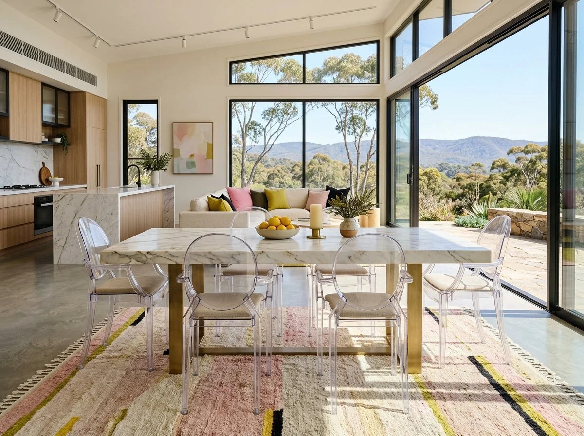
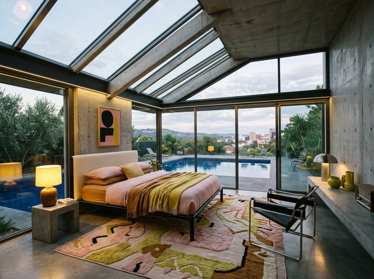
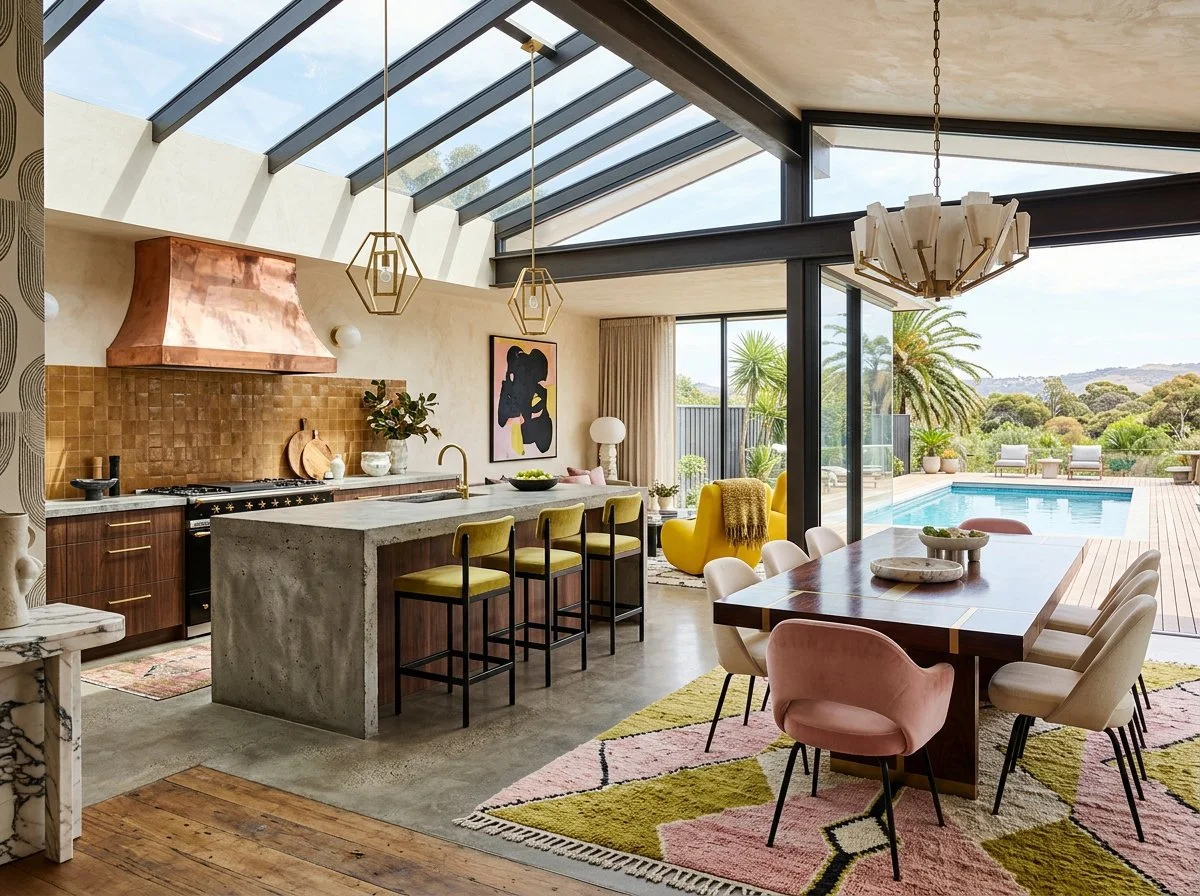
I’ve been playing with a colour palette for a client that includes soft pink, chartreuse, cream, yellow, and black. I love the combinations and the mid-century modern brutalist back=drop, so wanted to share my inspired renders for this post. yes, Ai, which is an excellent way to quickly share design ideas NOT replace the design process and documentation.
The Art of Juxtaposition: Why Your Home Needs a Little Creative Tension
Let me say something that might ruffle a few linen throw pillows: safe interiors are boring interiors.
There. I said it.
The rooms that stop you mid-scroll, the spaces that make you feel something the moment you walk through the door, the homes people photograph and then spend twenty minutes standing in — they're almost never the ones where everything matches perfectly. They're the ones where something shouldn't work but absolutely does.
That something? It's juxtaposition. And it's the single most powerful tool in my design arsenal.
So What Actually Is Juxtaposition?
At its most stripped-back: juxtaposition is contrast with intention.
It's not throwing a vintage lamp next to a modern sofa and calling it "eclectic." It's the deliberate, considered placement of elements that are different from each other — in texture, era, colour, shape, scale, or material — in a way that creates visual tension, then releases it beautifully.
The key word is deliberate. Juxtaposition isn't an accident. It's a decision.
And it shows up in interiors in more ways than most people realise:
Old meets new — an 18th-century console table styled with a brutalist lamp and a sleek vase
Rough meets smooth — raw limewash plaster walls behind polished marble surfaces
Bold meets restrained — one deeply saturated wall in a room of careful neutrals
Organic meets geometric — a perfectly round coffee table in front of a sharply angular sofa
High meets low — a bespoke upholstered chair next to a beautifully weathered op-shop find
When you understand juxtaposition, you stop decorating and start designing.
Why It Works (And Why Playing It Safe Doesn't)
Here's the design truth most people don't want to hear: the human eye is lazy. Given a room where everything matches, it scans once and checks out. There's nothing to hold it. Nothing to discover.
Contrast creates visual movement. It gives the eye somewhere to travel — from the rough to the smooth, from the dark to the light, from the expected to the delightful surprise in the corner.
And beyond the visual? Juxtaposition does something emotionally that perfect coordination simply cannot:
It creates personality.
A room that's been "matched" tells you what someone bought. A room built on intelligent contrast tells you who they are. It shows confidence, curiosity, and taste — the three things every great interior communicates.

Five Ways to Use Juxtaposition (Without Breaking the Room)
1. Mix Your Eras Shamelessly
This is my favourite and possibly the move I'm most evangelical about. Pair a Georgian armchair in a shocking velvet with a clean-lined contemporary sofa. Float an ornate gilt mirror above a minimal concrete shelf. Let a twentieth-century side table live next to your ultra-modern kitchen island.
The secret to making it work? Find the thread. A shared colour, a repeated material, a complementary scale. You don't need much — just enough to say "I meant to do this" rather than "I couldn't decide."
2. Play Textures Against Each Other
Texture is where juxtaposition becomes almost sensory. The moment you place a rough, tactile, handmade object next to something polished and precise, the room becomes interesting to touch as well as to look at.
Think: a hammered brass bowl on a lacquered sideboard. A chunky boucle throw across the arm of a sleek leather chair. Handmade ceramic vessels on a glass shelf.
Your eyes do the work. Your hands want to follow.
3. Be Brave With Colour Contrast
This is where people lose their nerve, and I refuse to let you. Colour juxtaposition isn't about slapping two colours together and hoping for the best — it's about understanding which colours create productive tension.
A deeply saturated teal sofa in a room of warm whites. A single burnt-orange wall in an otherwise cool, stone-toned space. Inky navy joinery in a kitchen of pale oak and marble.
The contrast does the heavy lifting. You just need the courage to commit.
4. Blend Design Languages
Industrial and Japandi. Mediterranean and mid-century. Art Deco and Brutalist. These combinations sound like they shouldn't work — and then they absolutely do.
When you blend design languages, you're not creating a mess. You're creating a point of view. The key is proportion: let one language lead and the other respond, rather than giving them equal billing and watching them fight.
5. Balance Your Shapes
Round versus angular. Curved versus linear. Fluid versus rigid.
This is the most quietly powerful form of juxtaposition — the one people feel before they can name it. A circular rug under a rectangular dining table. A curved banquette against a wall of geometric tiles. Organic-shaped sculptures on a very straight, very structured shelf.
Shape contrast creates flow. It keeps the room moving.
The Rules (Such As They Are)
I'm not a rules person. But I am a principles person. Here's what separates beautiful juxtaposition from a room that just looks confused:
Commit to the contrast. Half-hearted juxtaposition reads as indecision. If you're going to put an antique piece in a modern room, let it be actually antique. Don't sand down the edges.
Find your common thread. Every well-juxtaposed room has something that ties the contrasting elements together — a colour repeated across disparate objects, a material that appears in different forms, a mood that runs consistently through the space. Find yours before you start.
Scale matters enormously. A tiny vintage find next to a large contemporary piece disappears into irrelevance. A massive antique armoire in a room of small, delicate modern furniture dominates and suffocates. Get the proportions right.
Edit ruthlessly. The best juxtaposition is specific. Three or four deliberate contrasts land with impact. Fifteen simultaneous contrasts land with chaos. Know when to stop.
The Bottom Line
The most extraordinary homes I've ever walked into — the ones that stay with you, the ones you can still picture years later — were never the ones where everything was perfectly coordinated and carefully "safe."
They were the ones where someone had the confidence to place two unexpected things next to each other and let the tension between them become the magic.
Juxtaposition isn't just a technique. It's a design philosophy. It's the willingness to say: I know these things are different, and that's precisely why they belong together.
Now go find your contrast. Your home is waiting.
If you’re deep in Pinterest, second-guessing everything, and quietly spiralling… good. You’ve hit the point where design actually matters.
Now let’s turn that chaos into clarity.
Bring your plans, your screenshots, your “is this insane?” questions. We’ll sort it out—properly.
2 hours | $528 incl. gst | Adelaide or Zoom
Love, Penelope xx - Interior Architect and Interior Designer Adelaide Hills + Adelaide Eastern + Inner Southern
Beige is banned. Luxury is law. Apply within.
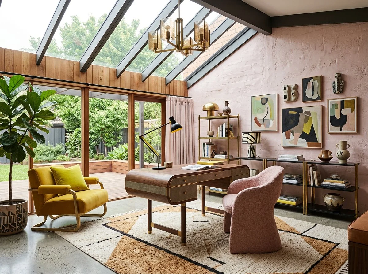
Plush Design Interiors uses AI‑generated imagery to help illustrate design concepts and possibilities in a fast, flexible and cost‑effective way. These images are inspirational visualisations only and may not represent final selections, exact colours, finishes or products available in Australia. All real‑world Plush Design Interiors work, including all design, specifications, selections and purchases, are curated by a human interior designer and are confirmed with clients using accurate samples, supplier information and detailed documentation before any work proceeds.
FAQs: The Art of Juxtaposition in Interior Design
Q1: What is the easiest way to start using juxtaposition if I'm a beginner?
Start with texture before you tackle anything else. Place one rough, tactile object next to something smooth and polished — a handmade ceramic next to a lacquered surface, a linen cushion against a velvet one. Texture contrast is low-risk, high-reward, and immediately makes a room more interesting.
Q2: Can juxtaposition work in a small space, or does it make things feel busier?
Done well, juxtaposition actually makes small spaces feel larger and more dynamic. The key is to use fewer, more deliberate contrasts rather than layering on multiple competing elements. One strong textural contrast or one bold colour move in a small room creates depth without overwhelm.
Q3: How do I mix old and new pieces without it looking like a mismatch?
Find a common thread — a shared colour, a complementary material, or a similar scale — that ties the pieces together. The contrast in era is the point; the common thread is what signals to the eye that it's intentional. For example, a contemporary sofa and a Victorian armchair in the same upholstery colour feel curated rather than accidental.
Q4: Is juxtaposition the same as eclectic style?
Not exactly. Eclectic style is a result — a look. Juxtaposition is a technique — a method. You can use juxtaposition within any design style, including very restrained, minimalist ones. A minimal room with one unexpected rough-textured element is using juxtaposition. It's not eclectic; it's precise.
Q5: What's the biggest mistake people make with juxtaposition?
Not committing. Half-hearted contrast reads as mistake rather than intention. If you're going to mix eras, mix them properly. If you're going to contrast a colour, make it genuinely contrasting rather than nearly-matching-but-not-quite. The boldness of the move is what makes it read as deliberate design rather than happy accident.
Q6: How many contrasting elements should I include in one room?
There's no fixed number, but I always say: three to five deliberate contrasts is a designed room. More than that and you're heading toward visual chaos. Choose your contrasts, make them count, and then edit down anything that isn't earning its place.