Why “Cloud Dancer White” Isn’t the Future We Ordered
The 2026 interior trend ‘Cloud Dancer White’ claims to be calm and timeless — but it’s really design-on-autopilot. Here’s why this overused neutral needs a rethink, and how to create richer, warmer spaces with real personality.
Every few years, white gets a new name and a new story — as if the right rebrand can make the same blank canvas feel inspired again. The latest? Cloud Dancer. Dreamy on the surface, sure. But behind the poetic marketing, it’s just another washed-out white posing as progress.
This isn’t about hating white. It’s about questioning why we keep worshipping it. Especially when Pantone Colour of the Year “Cloud Dancer” is being sold as the emotional, cultural, and aesthetic direction for 2026. Darling, we can do better than polite emptiness.
The Problem With White (Even the “Good” White)
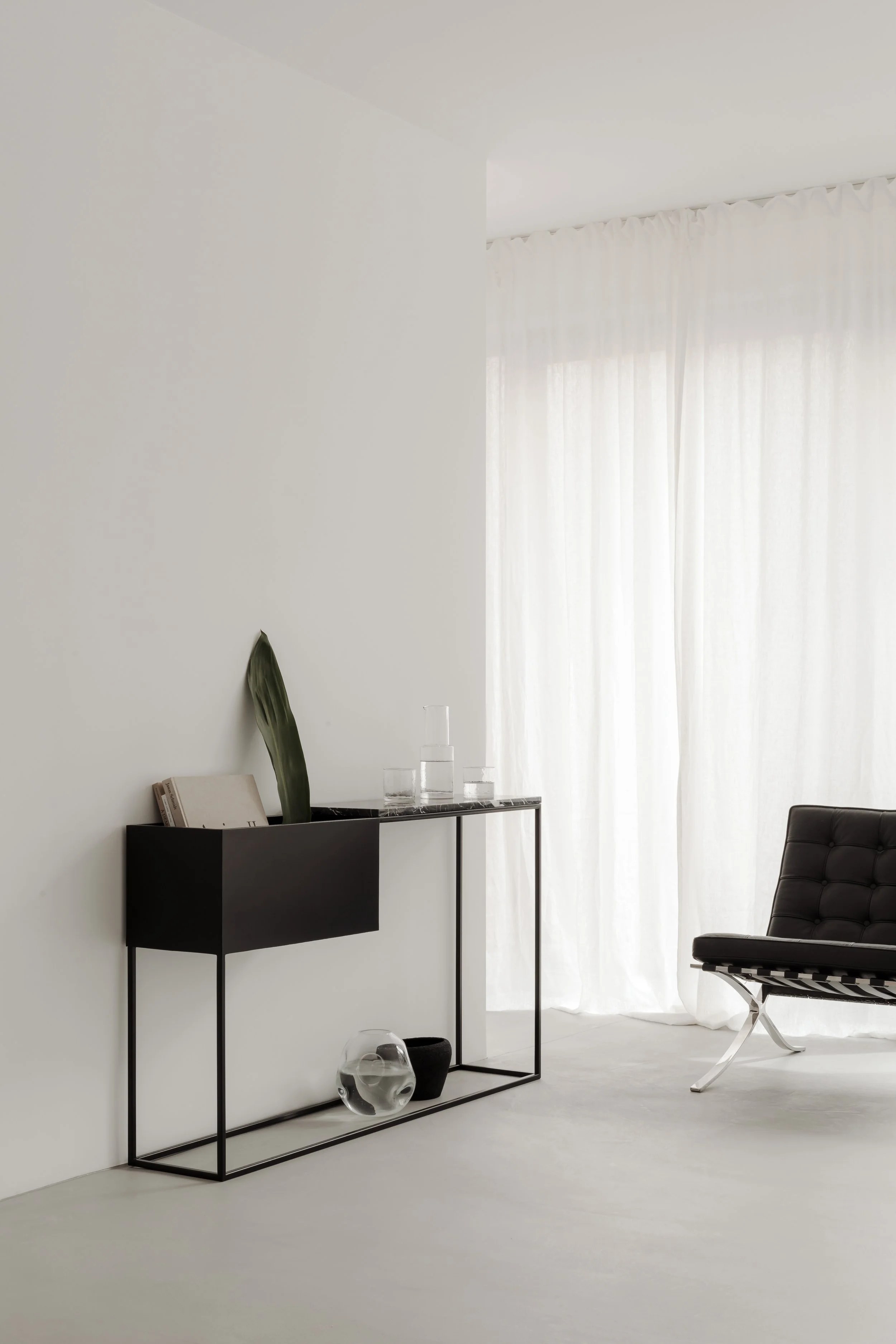
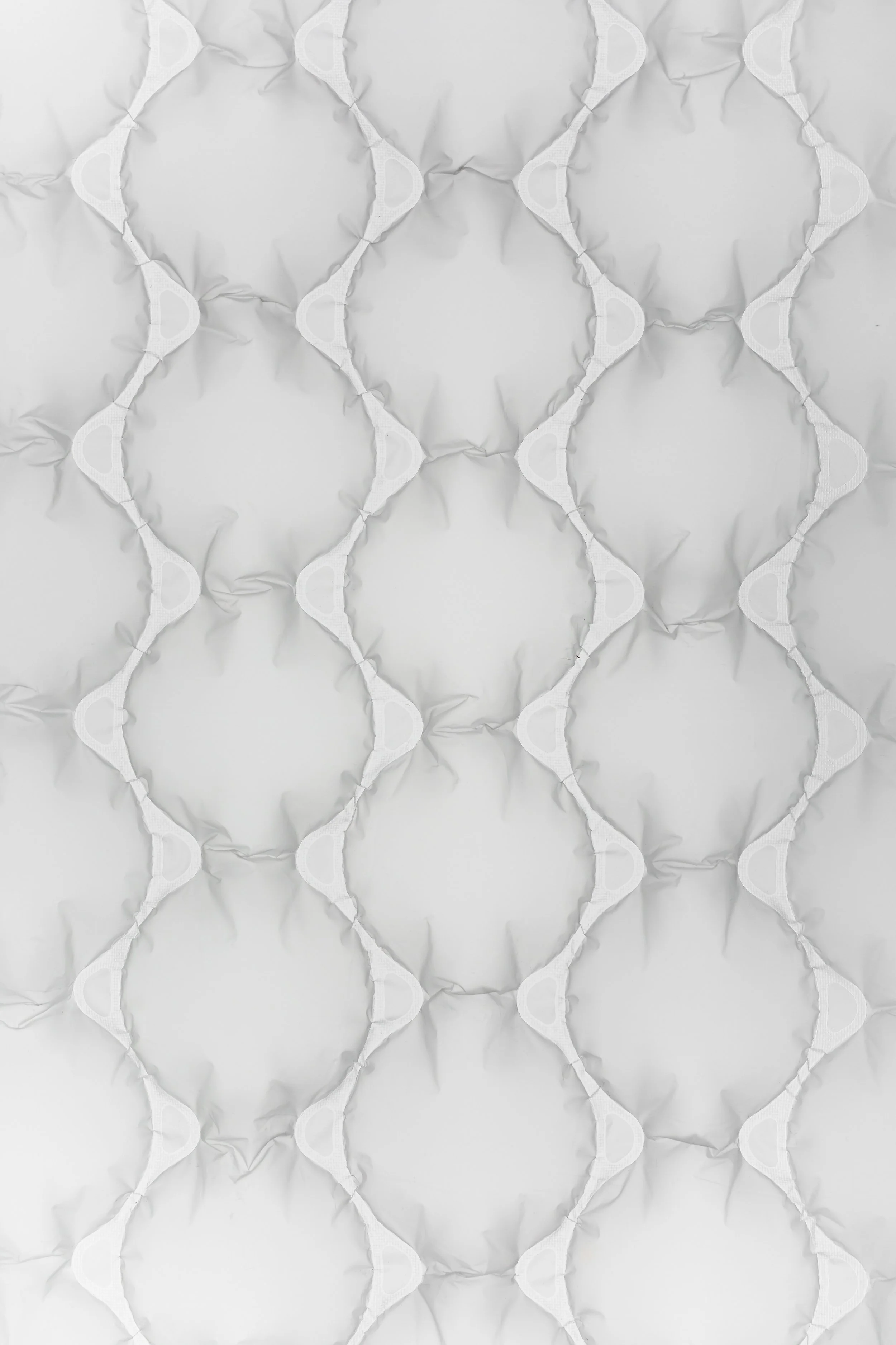
White has quietly become the answer to everything: calm, resale, minimalism, safety.
But here’s the truth — at this point, white isn’t a design choice. It’s a design default.
White interiors are often:
Emotionally neutral (translation: non-committal)
Overused to the point of visual fatigue
Used as crowd control, not self-expression
Practically impossible to maintain in real homes
Calling it a “trend” doesn’t make it brave. It makes it branding.
Why “Cloud Dancer” Feels Like a Step Backward
This isn’t innovation. It’s hesitation. “Cloud Dancer” represents:
Brands playing it safe
Mass appeal over individual identity
Soft sameness disguised as sophistication
Design should ignite, not disappear. When white becomes the headline, what’s left to say?
For those of us who crave warmth, depth, and personality, the return of “Cloud Dancer White” feels like being told to whisper in a room built for music.
What to Use Instead (Because You Deserve Better)
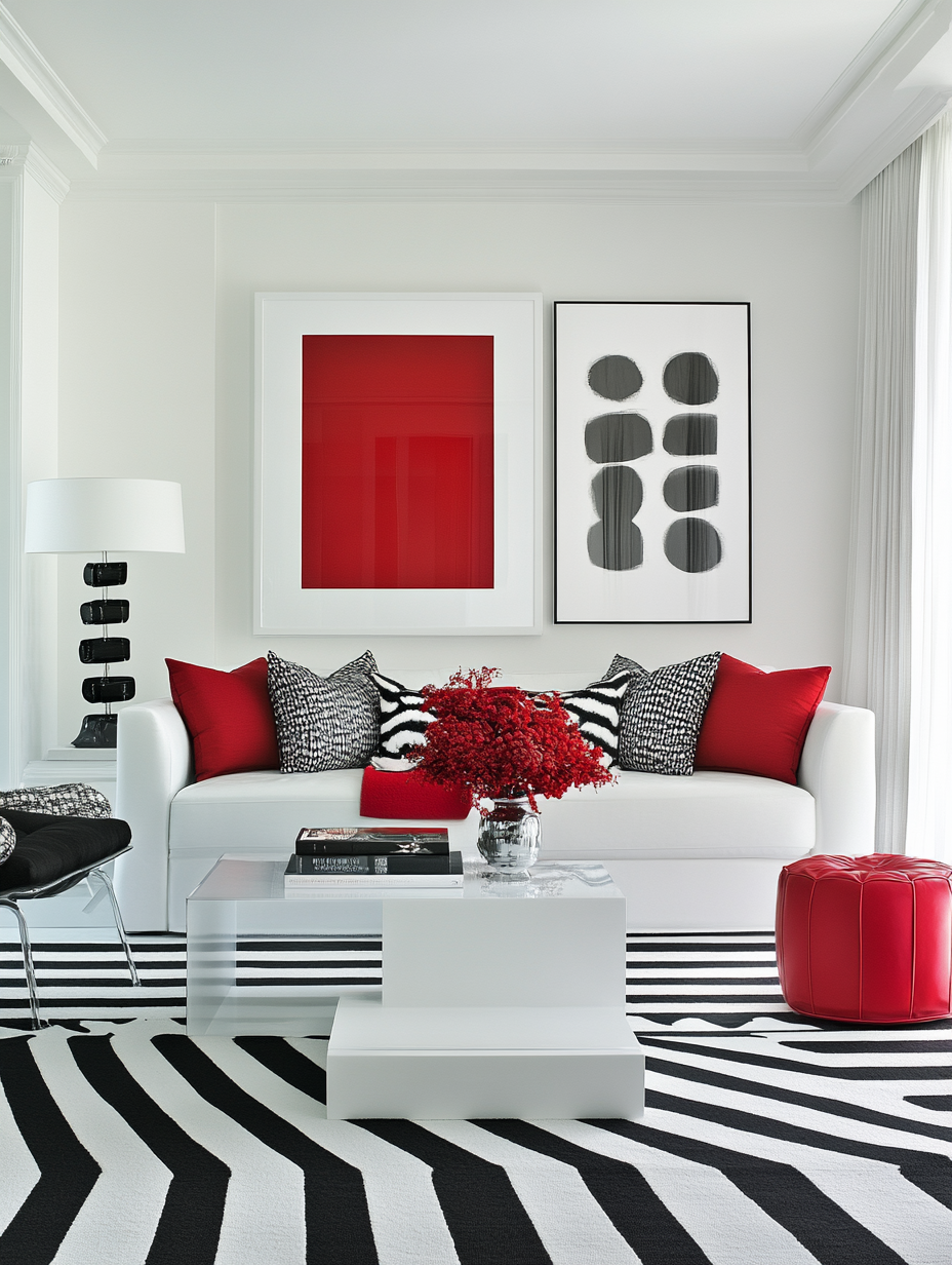
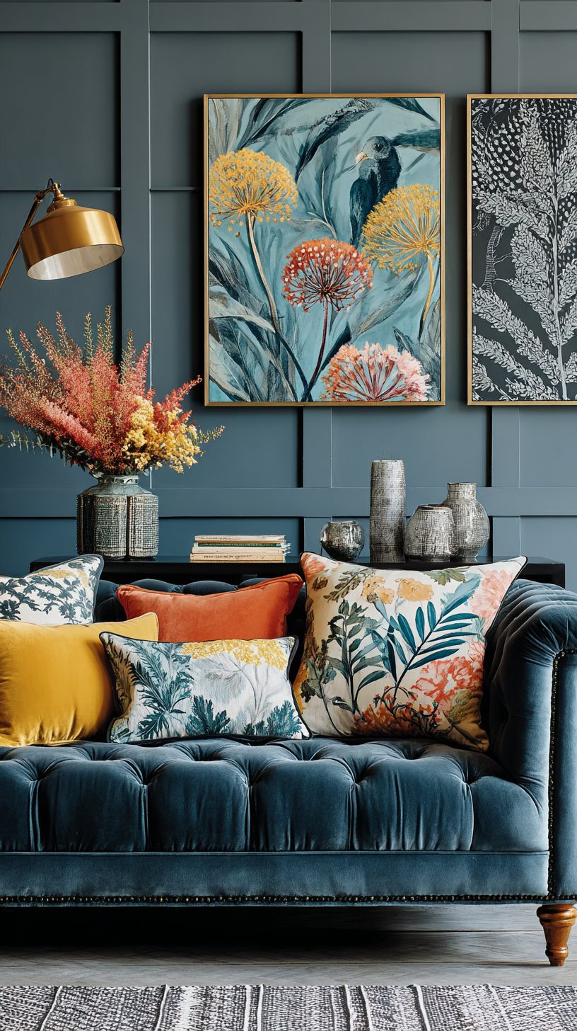
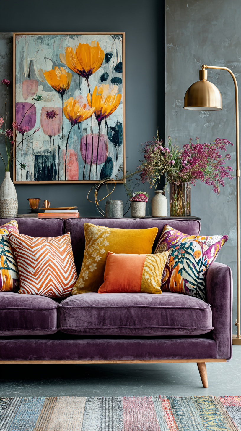
1. Choose Colour With Soul
Colour doesn’t have to shout to have power. Think olive over ivory, tobacco instead of taupe, mushroom, clay, ochre, or petrol blue. These hues calm, ground, and still carry emotion — no screaming required.
Design tip: Calm isn’t the absence of colour; it’s the presence of balance.
2. Layer Neutrals Like a Designer, Not a Showroom
Neutral doesn’t mean “no energy.” Bring in warm stone, timber grain, linen, limewash, microcement. Texture is colour’s secret ally — the element that adds depth without shouting for attention.
3. Let White Earn Its Place
White belongs in contrast, not command. Use it to lift ceilings, frame darker walls, or breathe between materials. It works best when it’s part of a conversation, not the entire story.
4. Design for Living, Not Liking
Ask yourself:
Does this space reflect me?
Does it energise or calm me?
Would I still love it without social media’s validation?
Spaces built for identity age beautifully. Spaces built for approval fade fast.


The Real Future of Colour
The next chapter of interior design won’t be pale and quiet. It will be considered — warm, personal, layered, confident.
The future belongs to spaces that feel like their people. To colours that tell stories, not hide behind trend names.
So if the trend cycle drifts into a polite, cloudy haze — let’s be the ones adding life, laughter, and a velvet-green sofa that refuses to stay quiet.
“Cloud Dancer” isn’t bold. It’s careful. And careful doesn’t move design forward.
When the world goes pale, real designers go deep. Richer colours. Warmer textures. Braver ideas. The kind that actually make a house feel alive.
Until next time, keep your neutrals nuanced and your whites on probation. Love, Penelope xx
Cloud Dancer White and Neutral Interiors FAQ’s
-
Cloud Dancer White is Pantone’s 2026 Colour of the Year, a soft, chalky white promoted as serene, versatile and future‑facing for interiors. In practice, it’s another rebranded white being used as a catch‑all “safe” choice for walls and decor, regardless of personality or context.
-
Cloud Dancer White feels like a step backwards because it encourages design on autopilot: bland walls, resale‑driven decisions and rooms that look calm but say nothing about the people who live there. It prioritises mass appeal and brand-friendly imagery over depth, identity and emotional connection, which is the opposite of what progressive interiors need in 2026.
-
All‑white interiors are often emotionally neutral, overexposed and hard to maintain in real life, especially in busy homes. White has shifted from being a considered design tool to a default used to avoid decisions, which leads to spaces that feel like showrooms or rentals rather than true sanctuaries
-
Instead of defaulting to Cloud Dancer, choose colours with soul such as olive, tobacco, mushroom, clay, ochre or petrol blue that ground a room and still feel calm. These hues bring warmth, nuance and emotion to a space so it feels lived‑in and layered rather than washed out and anonymous.
-
Layer neutrals by mixing texture and tone: warm stone, timber grain, linen, limewash and microcement all add depth without shouting. When you combine different surfaces and subtle variations of neutral, the room feels rich and dimensional instead of like a flat, one‑note “builder basic” scheme.
-
Yes—white belongs in contrast, not command. Use white to lift ceilings, frame darker walls, highlight architectural details or create breathing space between stronger materials, so it supports the story rather than silencing it.
-
Design for living by asking whether your space reflects you, supports how you feel and functions for your daily life, even when no one is looking. Rooms built around your identity, values and rituals age beautifully, while spaces built for social media approval date quickly and feel hollow once the trend cycle moves on.
-
The future of colour is considered, not colourless: warm, personal palettes, layered textures and confident contrasts that make a home feel like a biography, not a catalogue. Instead of chasing each new “it” white, the next chapter of design celebrates richer hues, nuanced neutrals and brave ideas that give homes a pulse
Why this page uses FAQ’s and how answer engine optimisation works in Australia.
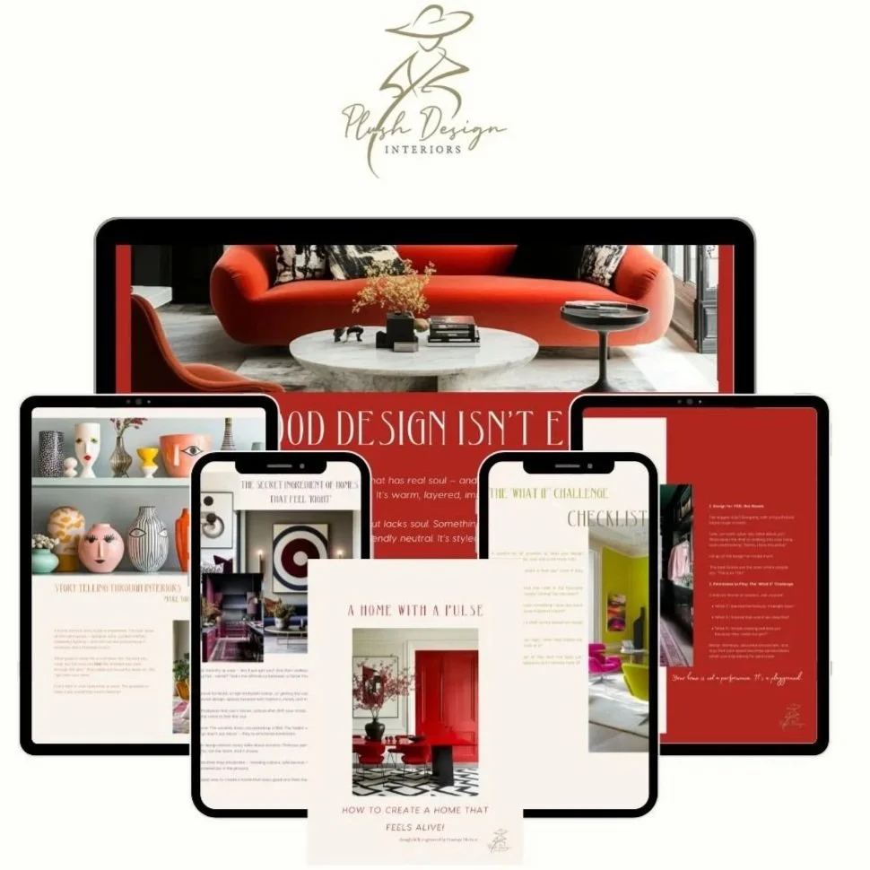
How To Create A Home With A Pulse
Your home should be your biography, NOT a catalogue! If your home feels more like a showroom than a sanctuary, you're not alone. We've been sold a version of "perfect" that has nothing to do with personal joy. "Home With A Pulse" is the antidote. It's a practical guide to infusing your space with the one ingredient that matters most: you.
Ditch the trends and discover your own ‘design DNA’. Overcome design paralysis and move past the fear of making mistakes. ‘Homes With a Pulse’ will show you how to create a home that’s YOU! Find your emotional colour palette, learn how to ‘mix’ not match, design for ALL the senses, build your home sanctuary, and so MUCH MORE. Create a home that heals, comforts, and inspires!