
2026 Interior Design Trends: Neo Deco, Cool Blue and Opera Aesthetic for No-Vanilla Homes
If 2025 was the year people finally admitted they were bored of beige, 2026 is the year they actually do something about it.
“Safe” interiors are quietly dying; homes with backbone, glamour and personality are stepping into the spotlight as the new standard, not the exception.
The 2026 interior design forecast is full of noise, but three 2026 interior design trends have real staying power:
Neo Deco, Cool Blue and Opera Aesthetic interiors. Used well, they are bold, liveable and fiercely anti-beige—and they play beautifully in Australian homes, from city apartments to Adelaide Hills retreats.
Why 2026 Is The Year Of No-Vanilla Design
Trend fatigue and the death of beige “safety”
Home lovers are exhausted by copy‑and‑paste rooms that look “fine” on a real estate listing but feel flat, generic and a little bit joyless in real life. Beige-on-beige, a sprinkle of black accents and the same three prints have officially become the design equivalent of elevator music.
At the same time, people are living and working at home more than ever, which means interiors have to work harder emotionally as well as functionally. A home needs to energise, comfort and express who lives there, not just impress the neighbours for ten seconds at the front door. The appetite for bold interior design trends in 2026 is a natural backlash against spaces that feel like rentals, even when you own them.
How Neo Deco, Cool Blue and Opera Aesthetic change the game
Neo Deco, Cool Blue and Opera Aesthetic all have one thing in common: they’re unapologetic. They bring structure, drama and mood into interiors in a way that still feels sophisticated, not gimmicky. Think geometry, gloss and metal detailing; saturated yet calm blues; layered fabrics and lighting that looks more couture than commercial.
These trends are flexible enough to work in a three‑bed suburban home, a character cottage in Aldgate or a high‑end cigar bar in the CBD. They’re also a gift for anyone committed to anti‑beige interiors and No‑Vanilla design: you can embrace them in big architectural moves or in considered, high‑impact layers.


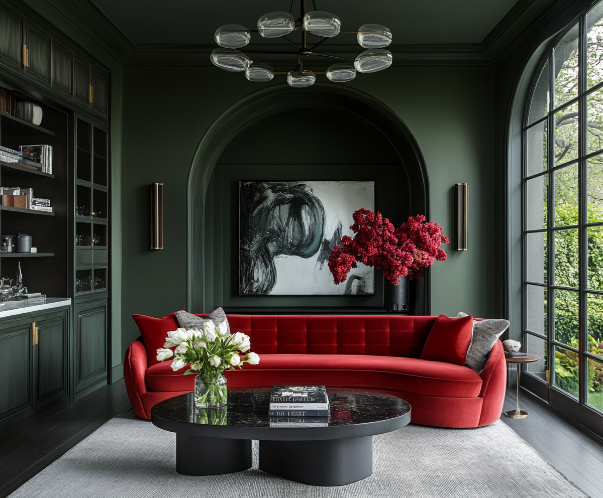
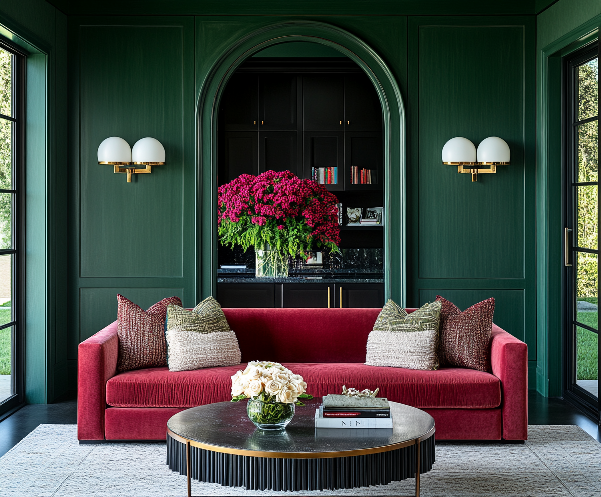
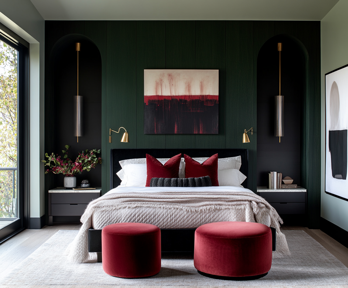
What Is Neo Deco Interior Design?
Neo Deco is the 2026 reboot of Art Deco - less museum piece, more modern glamour. It takes the confidence and geometry of classic Deco and updates it with contemporary materials, cleaner lines and a more relaxed attitude.
Instead of recreating a 1920s film set, Neo Deco interior design borrows the best bits: strong shapes, luxe finishes, dramatic lighting and a sense of occasion. It works beautifully in Australian homes because it loves light, responds well to high ceilings and is just as comfortable in a new build as in a renovated character property.
Key features of Neo Deco (geometry, gloss, metals, curves)
Neo Deco is all about clear structure and deliberate detail. You will usually see:
Strong geometry in joinery, panelling, rugs or tiled floors
Curves in furniture, archways, mirrors and lighting rather than fussy ornament
Glossy or satin finishes on cabinetry, stone or accent furniture to bounce light
Metals such as brass, brushed gold, chrome or blackened steel for contrast
Rich but controlled colour: inky blues, deep greens, claret, champagne neutrals
The overall effect is polished but not precious—grown‑up sophistication with a sense of fun.
How to use Neo Deco in living rooms, bedrooms and entries
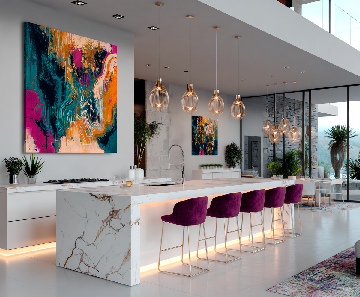
In living rooms, Neo Deco shines through statement joinery and lighting. Consider a fluted or panelled TV wall, a geometric rug, a curved sofa and a hero ceiling light or pair of sculptural wall lights. One or two well‑proportioned pieces will do more than an army of small accessories.
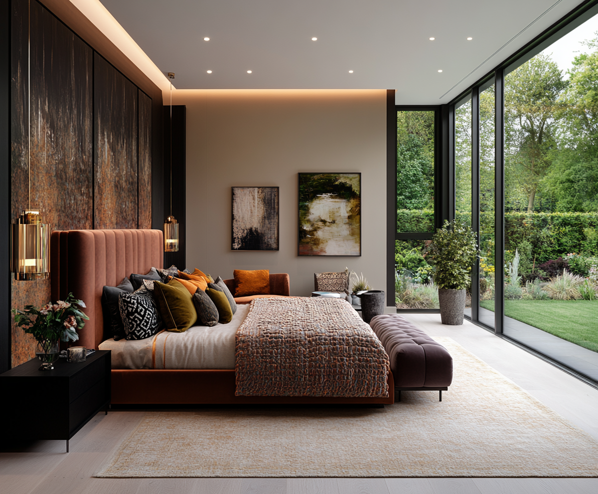
Bedrooms are perfect for an upholstered bedhead with vertical or scalloped detailing, gloss bedside tables with metal hardware and elegant wall lights or pendants instead of basic lamps. Add a lush rug and a single strong artwork and you have instant structure and glamour.
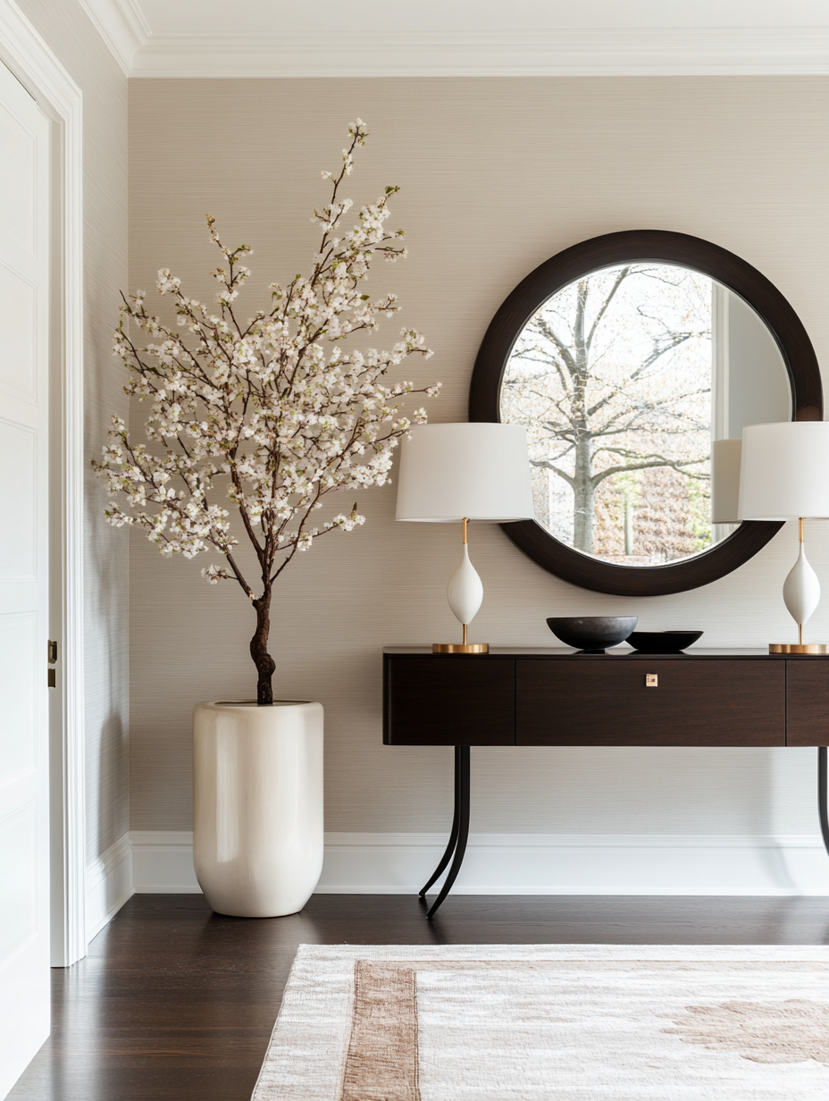
Entries love Neo Deco because they are transition spaces. Think bold tiled floors, a statement console with metal detail, an arched or oversized mirror and a dramatic pendant. This is where you can be bravest without overwhelming your everyday living zones.

Neo Deco for boutique commercial spaces (cigar bar, gin palace, wellness centre)
Neo Deco is a natural fit for boutique commercial interiors where clients expect mood and memory. A cigar or whisky bar can lean into darker tones, ribbed timber, brass, marble and low, glowing lighting for an intimate, clubby feel. A gin or champagne bar can take the same language and shift to lighter colour, mirrored surfaces and jewel‑like lighting.
Wellness centres can borrow Neo Deco curves and geometry without the heaviness: scalloped reception desks, arched doorways, softly rounded seating and a controlled palette paired with beautiful natural light. It feels high‑end and intentional without tilting into pastiche.
Common Neo Deco mistakes to avoid
The biggest trap with Neo Deco interior design is going literal and theme‑y: chevron everything, black‑and‑gold overload, and furniture that looks like it was ordered by costume department. Avoid matching sets and heavy pattern clashes.
Keep your base calm and your shapes strong. Prioritise quality over quantity: one exquisite light fitting, one tailored sofa, one standout joinery moment. And always edit—if the room starts to feel like a movie set instead of somewhere you’d curl up with a glass of wine, pull back.

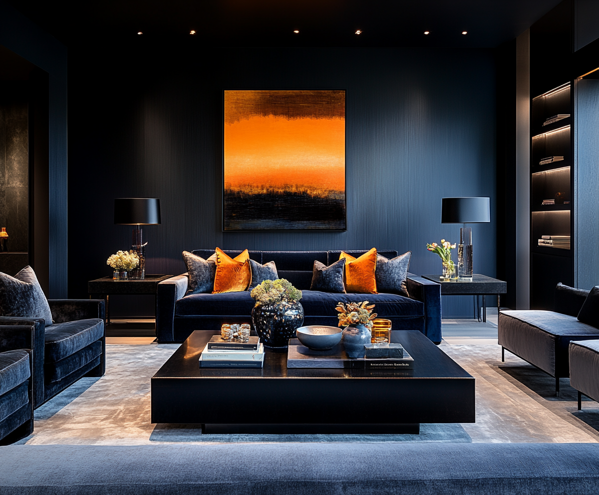
Cool Blue: The New Power Colour
Cool blue is stepping into 2026 as the power colour for people who want calm with backbone. Forget soft “maybe it’s grey, maybe it’s blue” paint and endless coastal clichés; this is blue with presence.
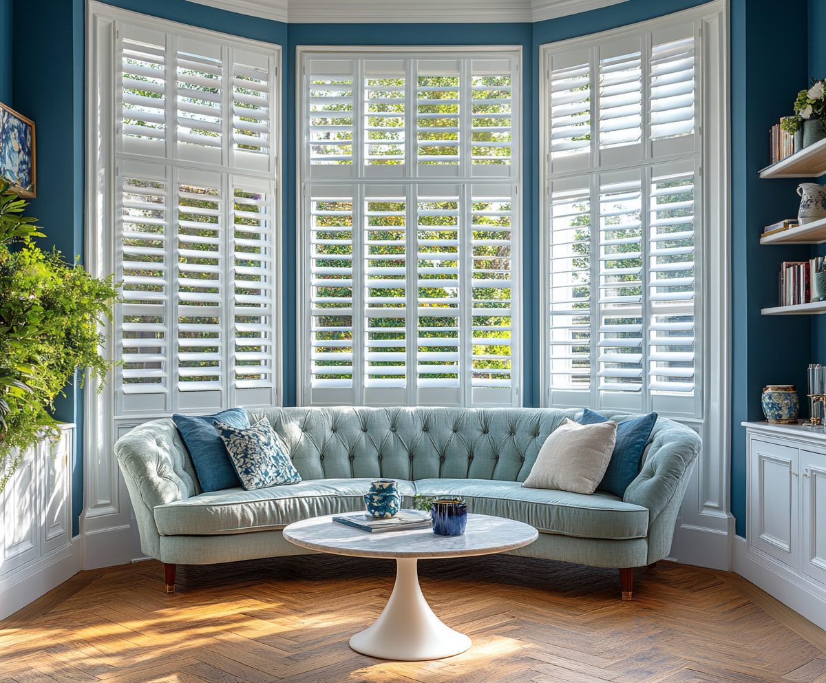
Cool blue interior design focuses on crisp, slightly steely blues—from ink and petrol through to glacier and slate—that ground a room instead of fading into the background. They’re perfect for Australian light, especially in spaces that feel washed out or too warm.
Cool blue vs coastal blue – why they’re not the same
Coastal blue is usually mid‑tone, chalky and relaxed, designed to evoke beach houses and holidays. There is nothing wrong with that, but it can look flimsy or theme‑y in the wrong context, especially when paired with predictable stripes, shells and whitewashed timber.
Cool blue in 2026 is sharper and more architectural. It sits beautifully with stone, metal and strong lines. It reads as sophisticated and urban rather than “beach shack” and works just as well in a sandstone villa in Adelaide as in a city apartment or new build.


Best cool blue shades for walls, joinery and upholstery
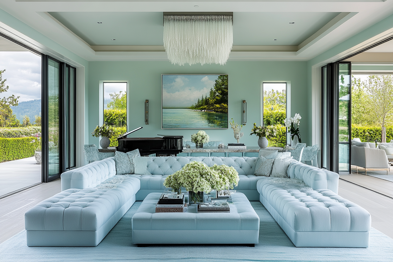
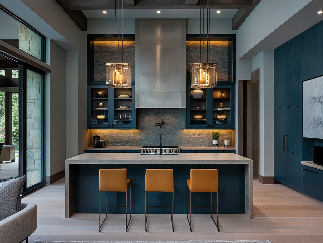
For walls, look for blues with a hint of grey or green that hold their own in strong daylight: think ink, steel or a modern slate blue. These shades are ideal for living rooms, dining rooms and bedrooms where you want cosiness without heaviness.
Joinery loves deeper blues: petrol, inky navy or charcoal‑blue on kitchen or bathroom cabinets can make stone benchtops, brass hardware and timber floors sing. For upholstery, consider textured linens, velvets or boucle in varying blue tones layered together so the room feels rich, not flat.
Pairing cool blue with metals, timber and texture
Cool blues come alive when balanced with warmth and texture. Pair them with:
Warm metals such as brushed brass or bronze for contrast
Mid to dark timbers for depth, or pale oak for a fresher look
Natural fibres like wool, linen and sisal
Tactile rugs and cushions in varied weaves rather than one flat fabric
Avoid defaulting to white everything else. Off‑whites, soft taupes and muted stone tones will look more considered and less like a template.
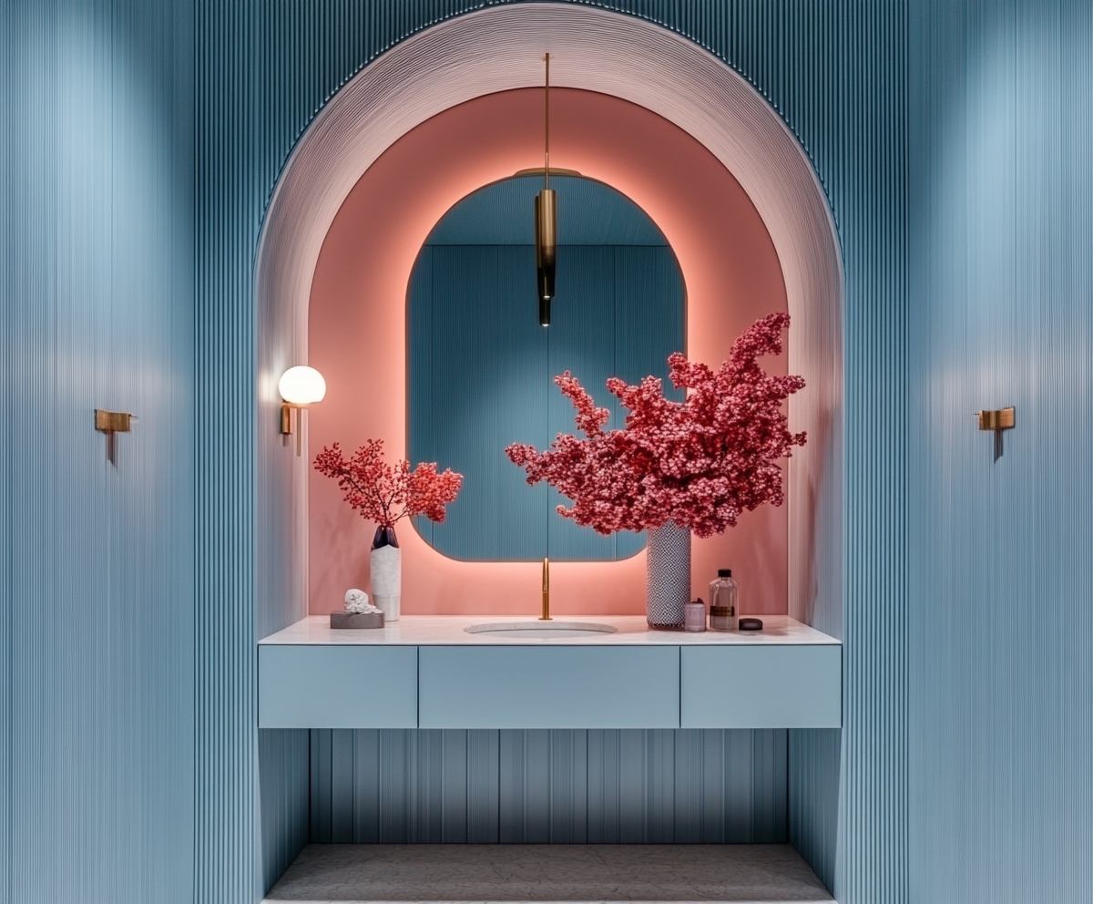
Cool blue ideas for bathrooms, kitchens and home offices
Bathrooms love cool blue on vanity joinery, feature tiles or painted walls paired with stone and metal. It instantly elevates a simple space and feels spa‑like without being bland.
Kitchens can carry blue on lower cabinets or a full wall of joinery, offset with stone, timber and interesting lighting. In a home office, a cool blue wall or cabinetry background looks professional on video calls but still stylish and distinctive, especially framed with artwork and layered lighting.


Opera Aesthetic Interiors: Drama Without The Costume
Opera aesthetic interiors bring theatre into everyday life—but in a considered, elegant way. Think drama in the lighting, fabrics and silhouette rather than rooms that look like a set from a production.
In 2026, opera aesthetic interiors focus on mood: shadows, glow, drape and rich tactility. It’s about making certain spaces feel special, intimate or a little bit decadent so your home doesn’t read as one flat emotional note.
What “opera aesthetic” really looks like in a home
Opera aesthetic at home is less about opera posters and costumes, more about how a room feels when you walk in. You might see:
Velvet or silk drapery with generous fullness
Fringed or pleated lampshades and sculptural lighting
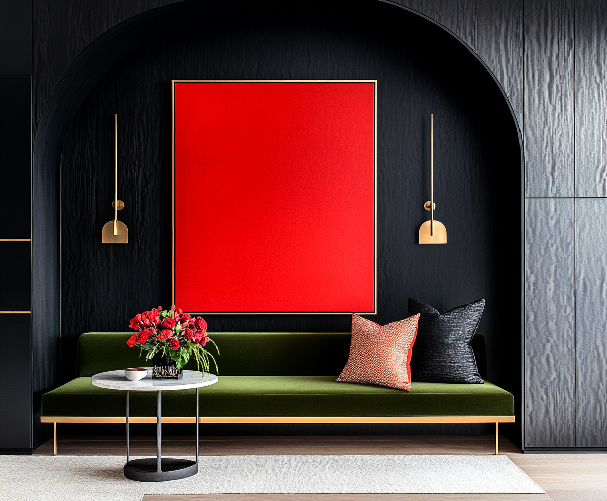
Deep, saturated colours in small doses: oxblood, forest, midnight, plum
Statement seating or a beautifully shaped bed that anchors the room
The look is layered and touchable, not stiff or fussy. It can sit inside a modern shell or a period home equally well.

Creating drama with lighting, fabric and colour
Lighting does the heavy lifting here. Swap basic downlights for dimmable wall lights, lamps and pendants that cast interesting shadows. A single extraordinary table lamp can change the entire feel of a powder room or bedside.
Fabrics should invite touch: velvets, chenilles, heavy linens and boucle are all excellent. Use them on sofas, chairs, bedheads and curtains. Colour can be strong but targeted—perhaps a deep red velvet chair in a Cool Blue room, or a jewel‑toned bedhead against a moody wall.
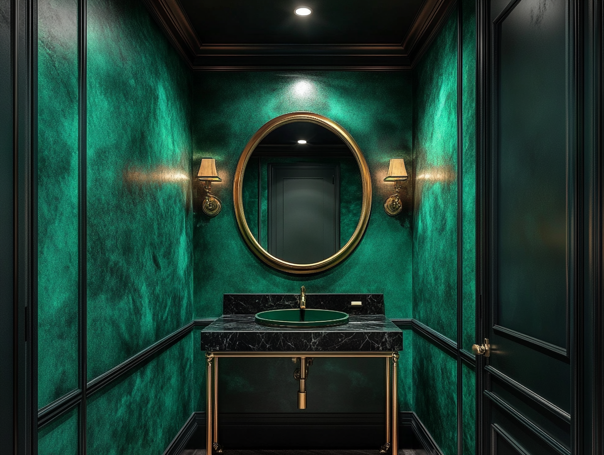
Opera aesthetic in powder rooms, hallways and bedrooms
Powder rooms are the perfect place to go all in: patterned or dark walls, a dramatic mirror, an ornate or sculptural light, a stone or coloured basin and a beautiful tap. It’s a five‑minute experience that leaves a serious impression.
Hallways and stairwells can benefit from oversized art, unexpected lighting and richer paint colours. Bedrooms are ideal for opera aesthetic interiors with generous drapery, upholstered bedheads, layered bedding and low, warm lighting instead of a single harsh ceiling fitting.
How to avoid turning your home into a stage set
The key is restraint and contrast. If every room is on full volume, nowhere feels special. Choose specific zones for full opera drama and keep adjacent rooms a little calmer, still within your No‑Vanilla palette.
Avoid literal themes—no faux theatre masks, costumes or prop‑like furniture. Focus on quality materials, beautiful shapes, and lighting that flatters people and architecture. If something feels novelty rather than timeless, leave it out.
How To Combine These 2026 Trends In A Real Home
Done well, Neo Deco, Cool Blue and Opera Aesthetic happily share the same address. The trick is assigning each one a role.
Neo Deco brings structure and backbone. Cool Blue handles calm, confident colour. Opera Aesthetic delivers moments of drama and softness. Together, they create homes that feel luxurious, intentional and unmistakably personal.

Layering Neo Deco structure with Cool Blue colour
Start with architecture and joinery: Neo Deco can guide your choice of panelling, cabinetry profiles, curved elements and lighting. Once the bones are strong, introduce Cool Blue on key surfaces—walls, joinery or large upholstered pieces.
The combination of clear shapes and confident blue grounds the space and makes it feel designed, not accidental. From there, layer in neutrals, timber and metal to balance warmth and coolness.
Adding Opera drama in small, high-impact moments
Once your base is established, choose a few spots for opera aesthetic interiors to shine. That might be:
A velvet bench and fringed lamp in the entry
A jewel‑toned bedhead and full‑length drapes in the main bedroom
A moodily lit powder room with rich colour and sculptural fittings
These touches are like punctuation marks in your home: they keep the experience dynamic, not monotonous.


Work With A No-Vanilla Designer In Adelaide
If you’re ready to leave beige “safety” behind and step into a 2026 interior that actually reflects who you are, this is the moment. Neo Deco interior design, cool blue interior design, and opera aesthetic interiors are powerful tools—but using them well takes a trained eye and a clear vision.
Plush Design Interiors works with home lovers and boutique commercial clients across Adelaide and the Hills who want bold, liveable, anti‑beige spaces with a bit of drama and a lot of intention. Whether you’re planning a renovation, new build, luxe Airbnb, wellness centre or a cigar or gin bar with real presence, a No‑Vanilla approach will set you apart.
Ready to give your home—or your next project—a backbone? Get in touch to chat about your renovation, new build or boutique commercial space and let’s create a 2026 interior that you can’t wait to show off.
Love, Penelope xx Interior Designer and Anti-Blah Campaigner
Plush Design Interiors uses AI‑generated imagery to help illustrate design concepts and possibilities in a fast, flexible and cost‑effective way. These images are inspirational visualisations only and may not represent final selections, exact colours, finishes or products available in Australia. All real‑world Plush Design Interiors work, including all design, specifications, selections and purchases, are curated by a human interior designer and are confirmed with clients using accurate samples, supplier information and detailed documentation before any work proceeds.
Neo Deco, Cool Blue, and Opera Aesthetic FAQ’s
-
The three key 2026 interior design trends are Neo Deco, Cool Blue and Opera Aesthetic, all of which bring structure, mood and personality into anti‑beige homes. Used well, they create bold but liveable interiors that feel luxurious, intentional and deeply personal rather than generic or “for resale
-
Neo Deco is a modern reboot of Art Deco that keeps the geometry, curves and sense of occasion, but updates them with cleaner lines, contemporary materials and a more relaxed attitude. Expect strong shapes, gloss and metal accents, sculptural lighting and rich but controlled colour that feels grown‑up and glamorous without turning your home into a film set
-
In Australian homes, Neo Deco works brilliantly through fluted or panelled joinery, curved sofas, geometric rugs, bold entry floors and hero lighting pieces. It suits everything from light‑filled new builds to character homes and can scale up for boutique commercial spaces like cigar bars, gin palaces and wellness centres that need mood and memory.
-
Cool Blue is the 2026 power colour: crisp, slightly steely blues that ground a room and read as calm but confident rather than coastal or wishy‑washy. These blues work beautifully with Australian light and pair well with stone, metal, timber and texture to create spaces that feel sophisticated, not beach‑theme cheesy
-
Coastal blue is softer and chalkier, designed to evoke relaxed beach houses, but it can look flimsy or theme‑y when overdone with stripes and whitewashed timber. Cool Blue in 2026 is sharper and more architectural, sitting comfortably in city apartments, sandstone villas and new builds where you want backbone and polish.
-
Cool Blue works on walls, kitchen and bathroom joinery, upholstery, home offices and even feature tiles, especially when layered in different tones for depth. Team it with warm metals, textured fabrics, timber and off‑white or stone neutrals so the space feels rich and considered instead of flat and cold
-
Opera Aesthetic interiors bring drama, mood and a sense of theatre into everyday rooms using lighting, fabric and silhouette rather than literal stage props. Think velvet or silk drapery, sculptural lighting, deep colours in targeted hits and beautifully shaped seating or bedheads that make certain spaces feel special.
-
Choose a few zones—like powder rooms, hallways or main bedrooms—for full drama and keep neighbouring rooms calmer within your No‑Vanilla palette. Focus on quality materials, flattering lighting and strong shapes, and skip anything that feels costume‑y or novelty so the look stays timeless, not tacky.
-
Yes, Neo Deco, Cool Blue and Opera Aesthetic are designed to play together in one home when each has a clear role. Use Neo Deco for structure, Cool Blue for confident colour and Opera Aesthetic for pockets of drama so your rooms feel cohesive, layered and emotionally dynamic rather than chaotic
-
These trends are ideal for boutique commercial spaces like cigar bars, gin and champagne bars, luxe Airbnbs and wellness centres that need atmosphere and memorability. Neo Deco gives a strong architectural language, Cool Blue keeps things calm but elevated, and Opera Aesthetic layers in the glow, texture and drama clients never forget
-
Working with a No‑Vanilla interior designer in Adelaide means you get a tailored mix of Neo Deco structure, Cool Blue palettes and Opera Aesthetic mood that matches your home and lifestyle. Plush Design Interiors specialises in bold, liveable, anti‑beige spaces for residential and boutique commercial projects across Adelaide and the Hills, from renovations and new builds to cigar bars and wellness centres
Don’t Get Ripped Off By Your Reno
Your renovation shouldn’t be a guessing game! It should, and can, be strategic and no-nonsense. ‘Don’t Get Ripped Off By Your Reno’ is an Australian renovation guide for people who refuse to ripped off by builders, bamboozled by designers, blindsided by renovation costs, and ending up with a result that doesn’t feel right.
