
How to Choose a Sofa Colour That Won’t Bore You to Tears
Forget “safe” grey. Here’s how to choose a sofa colour with personality that actually works in your real-life living room.
It’s the colour of safety, of “good taste,” of not offending anyone. And yet, have you ever sat in a beige room and felt your brain quietly fall asleep? Here’s the uncomfortable truth: your beige sofa might be gently murdering your creativity.


Before you panic, this isn’t an attack on you, it’s a wake-up call about what happens when we design out of fear instead of intention.
The Beige Trap: Safe, Subtle… and Spiritless
Most people choose beige because it feels neutral, timeless, and “goes with everything.” But here's what it doesn’t do: inspire you, energise you, or reflect anything remotely unique about who you are.
Beige isn’t a personality. It’s the absence of one.
The problem with defaulting to beige is that it creates a sensory flatline. Without contrast, texture, or colour that stimulates your brain, your environment becomes a kind of visual white noise. And white noise doesn’t spark innovation, it lulls you into creative silence.
In a world that constantly demands originality and adaptability, designing your home to be forgettable is one of the most limiting things you can do.
If you’re done with vanilla decorating, subscribe to The No‑Vanilla Design Manifesto on Substack for weekly anti‑beige design plots.
Why Your Sofa Colour Matters More Than You Think
You might be thinking: “It’s just a sofa, chill.” But our surroundings have a massive influence on how we think, feel, and act.
Studies in colour psychology and environmental design show that our immediate environment can either boost or stifle things like:
Problem-solving
Mood regulation
Focus
Confidence
That means your home isn’t just your backdrop, it’s part of your mental architecture. And if your living room looks like a waiting room, don’t be surprised if your creativity feels... stuck.


What Colour Sofa is Best For My Living Room?
Good news: this doesn’t mean you need to chuck the whole sofa into hard rubbish. You don’t need a full renovation, just a bold mindset shift.
Choosing a sofa colour starts with one courageous decision.
Look at your beige sofa. Now imagine it wearing something with a pulse:
A jewel-toned velvet throw in emerald, mustard, or magenta
A bold print cushion with texture and movement
An oversized artwork hanging behind it with colours that clash deliciously
Let the contrast create curiosity. Let the eye linger. Let the energy of your space shift, even if just slightly. When choosing a sofa colour for Australian homes, think about the views from your windows. Bring the outdoors in. For example, greens, ochres, and blues.
Alternatively, stop searching for green sofa living room ideas and look for red sofa ideas. The leafy greens of your garden will work beautifully with a red sofa because red and green are opposite on the colour wheel.


Add contrast, not clutter.
Bold design doesn’t mean busy. You’re not trying to become a maximalist overnight (unless you want to—then go knock yourself out!). But adding intentional contrast—something soft and something sharp, something warm and something wild—brings balance and personality.
Did you know Frank Lloyd Wright often used colour blocking to manipulate energy within a room? He believed space should be emotionally guided, not just visually appealing. That’s right. Colour is not just decoration—it’s strategy.
So when you’re thinking coloured sofa or neutral sofa, don’t go past a sofa colour that is surprising AND stylish.


Reclaiming Your Design Voice
That beige sofa? It can stay, if it wants to, but only if it earns its place in a room that reflects you. A room that’s brave enough to stand out, smart enough to feel good, and authentic enough to be truly lived in.
So ask yourself: is this space helping me grow? Or is it helping me hide?
If it’s the latter, it’s time for a design intervention.
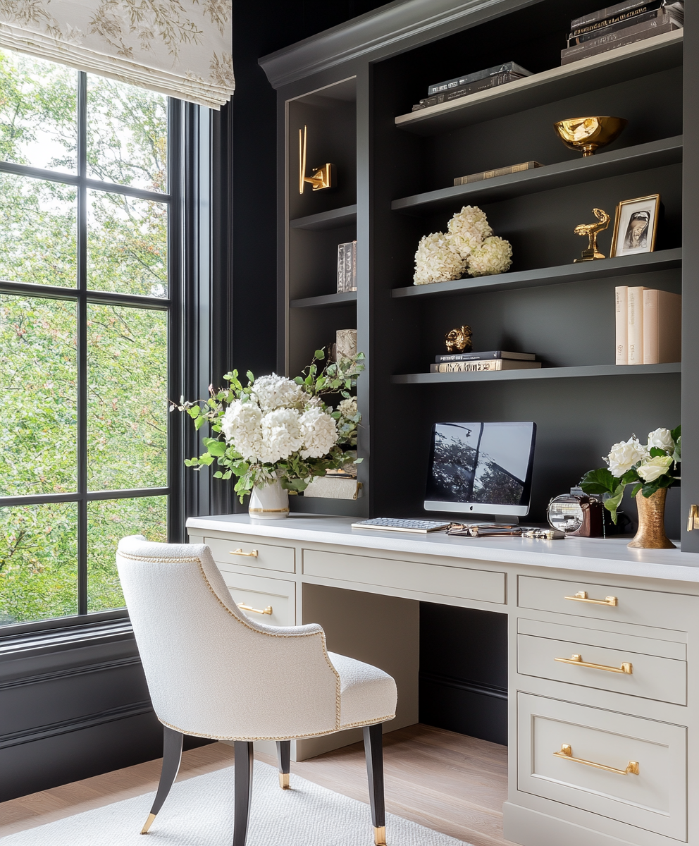
Another consideration is the colour of the walls. As an interior designer in Adelaide, I often make these types of decisions and there is never one answer. Do you want a tonal effect or a contrasting effect? Can you combine a coloured sofa with a gorgeous wallpaper? Of course you can, and I encourage it.
Want More?
Inside the No-Vanilla Design Manifesto, we explore how to turn neutral, generic spaces into wildly intentional sanctuaries. We go beyond Pinterest-perfect styling and teach you how to design for:
Function and flow
Creative energy
Emotional resonance
Your real, actual life (yes, even the messy bits)
If your home feels more beige than bold, this course is your next step.
Join the rebellion. Uncover your design voice. Burn the beige.
For deeper dives into designing a home that actually ROARS, not whispers, join my Substack. Is Your Home Whispering… or Roaring?


How To Choose a Sofa Colour FAQ’s
-
The best sofa colour is the one that works with your flooring, wall colour and light, and matches how you actually live, not just how the room looks on Instagram. Neutrals are versatile, but deep greens, blues and rusts can be just as timeless when they relate to your existing palette.
-
As a rule, a darker sofa against lighter walls creates contrast and makes the sofa feel grounded and intentional. If your walls are already dark, a mid‑tone or slightly lighter sofa can stop the room feeling heavy while still looking luxurious.
-
A coloured sofa is furniture, not a structural feature, so buyers are more interested in the bones of the home than whether your sofa is navy or emerald. If you’re nervous, choose saturated but sophisticated shades like deep blue, forest green or terracotta that age better than pale greige.
-
Mid‑tone shades in textured fabrics are your best friends because they hide stains and wear far better than very light or very dark flat weaves. Charcoal, olive, denim blue and warm taupe usually look cleaner for longer than cream or stark black.
-
Repeat the sofa colour at least three times in the room—in cushions, artwork, a rug, or decor—so it feels like part of a scheme, not a one‑off shout. Then add one contrasting accent colour to keep the palette feeling playful and designed, not matchy‑matchy.